The Beige Epidemic and Safe Brands
I was laying in bed the other night, not sleeping, so I made some tea and picked up my phone to do some light research on a new brand I’m working on for a wellness coach. Aside from the boring essence that nearly put me to sleep again, all I was seeing were beige vibes and desaturated sameness that came at me like a big yawn and minimalist mood board. Have you noticed this? There seems to be a rise in muted branding? Scroll through Instagram. Open Pinterest. Browse your inbox. It won’t take long before you notice a pattern. Every brand seems to be bathing in the same desaturated color palette, using the same vanilla branding, airy sans-serif typography, and sharing the same vague value premise about alignment and intention. It was like a cyclical brand déjà vu.
If you know designers, you know we do love our minimalism. While the statement of delicate design began as a sort of an understated opposition to consumerism, it seems to have evolved into something we’ve gotten lost in, and essentially feels more as though it has confined us in a space of sameness. This minimalist style, while deserves its own space, has also become a sort of beige epidemic that feels more like cold comfort of curated perfections.
Are we Becoming a Little…Forgettable?
The issue isn’t that minimalist brands are bad. They’re just a little *yawn, forgettable. So, what’s the problem with this? Nothing if the scroll is designed to help you find your sleep again, but everything if you want to stand out as memorable. Brands with distinctive assets are more likely to be remembered. In her book, Building Distinctive Brand Assets, Jenni Romaniuk helps us better understand “a distinctive brand asset is a unique element that helps consumers quickly identify and remember a brand, creating a mental shortcut in their minds.” What does this mean for us when trying to stand out in business? Forgettable brands don’t make an impact, don’t make a statement, and worst of all, they typically don’t last.
How Did We Get So Understated?
When did this become, like, a thing? How did we get stuck in such nondescript branding? The rise of plug-and-play branding solutions, aesthetic-driven trends, and the ever-tempting safety net of what’s working has led to a sea of look-a-like businesses. Real talk moment, it’s complicated starting a business and being a design creative is a pretty unique skill. So if your focus is on establishing and building your business, do you really have time to learn the ins and outs of design or building a brand? Not likely.
This is where the plug and play designs have shown up ready for quick resolve. While this is certainly beneficial to helping you lift your ass off the ground and into your market, it’s not always the best for making sure your product or offering is guaranteed to stand out above others, even if it really does. Because of this, instead of focusing on unique brand identity development, many brands have become indistinguishable.
- Social media aesthetics – The pressure to be ‘visually cohesive’ at the cost of originality.
- Overused templates – Canva is great, but when thousands of brands use the same layout, they start blending together.
- Minimalism without meaning – Simple is effective. Generic is not.
I promise there is some good news hidden in here, and it’s this…breaking out of the mold isn’t about reinventing the wheel. Rather, it’s about understanding what makes the wheel unique. What makes a brand truly distinct.
Step One: Clarify Your Brand Strategy Before You Design
For all my beautiful non-designer friends that are killing it at creating their businesses, whether you’re a coach, an artist, and author, your brand is not a logo. Your brand not a color palette. What it is, is you. It’s who you are. So really, before you dig into the visuals, you need to poke around a little into who you are. A brand’s visuals should be the result of its strategy, not the starting point. Before touching fonts or colors, ask yourself:
- What is the one thing my brand stands for, no matter what?
- What do I want people to feel when they interact with my brand?
- If my brand were a movie, what genre would it be?
Once you nail this down, your brand starts making decisions for you. As a result, instead of defaulting to what’s trendy (or beige), you’ll avoid bland branding and really create something that’s undeniably yours.
Step Two: Use Aesthetic as an Accent, Not a Crutch
Your visuals shouldn’t be a safety net that’s like “meh, this looks good enough.” You are the face of the brand. You’re not just all style, you know how to hold a conversation. Same with your aesthetic. Your aesthetic is the accent, not the entire personality. Your visuals should support your message, not define it. One of the biggest mistakes in bland branding is choosing aesthetics based on trends instead of meaning. Visuals should support your brand’s message, not define it. For example, let’s look at where brands typically go wrong:
- Choosing a color palette because it’s “in” rather than because it communicates something meaningful.
- Using typography that feels safe rather than one that explores bravery and adds personality.
- Mimicking design trends instead of developing a unique brand identity.
Now, don’t get me wrong, a brand doesn’t have to be loud to stand out. That’s not everyones jam. However, it does need personality. A curated blend of visual and verbal identity is what separates the enduring brands from the bland, beigey ones that fade into the background.
Step Three: Don’t be Too Understated, Give People a Feeling
Beige can be really pretty…if it fits your brand, otherwise, it’s like elevator music of branding. Like background noise that no one remembers, and you totally can’t dance to. Well you can, but it probably looks weird. People don’t often connect with the safe brand choice. They connect with something that moves them. People don’t remember vanilla brand beige in a sea of other beige. They remember brands that entice them and evoke something real. Consider asking yourself:
- Does my brand feel human, or does it sound like AI-generated marketing copy?
- Am I telling a story, or just filling space with curated aesthetics?
- Is my brand positioning leading, or just following what’s already out there?
The truth is, brands that resonate aren’t trying to be everything for everyone. Instead, they lean into their quirks, take creative risks, and embrace a distinct voice. One that is sharp, clear, and full of conviction.
Stepping Away from Safe Branding and Creating Differentiation Success
Here’s a little peek at some transformation examples that show you don’t have to be wild to standout. Sometimes, it’s a distinct difference from a unique part of your company that steers away from conservative brand strategy and differentiates you from your competition.
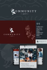
A favorite client, Community Act is a mediation program dedicated to serving underrepresented communities. Not just any mediation service, Community Act’s purpose was to change the conversation around conflict resolution. When it came to designing their brand, the goal wasn’t just to make them look clean and polished, and like every other corporate organization in the field of law. More so, it was to position them as the go-to for organizations that truly care about equity, communication, and community impact.
Where most mediation firms lean into cold, corporate aesthetics, Community Act needed a brand that felt human, approachable, and deeply aligned with their mission. We wanted to create a visual identity that reflected collaboration over confrontation, and the deep ancestry of their culture. Using modern colors with a vibrant and deep maroon accent and structured typography we designed every brand element to reinforce their culture of inclusivity and progress-driven solutions.
Instead of blending in with the sea of traditional legal mediators, Community Act’s brand now not only communicates who they are, but also helps them stand out as the bridge between conflict and resolution, designed for real-world impact.
Next Steps: Stand Out or Fade Into Generic Branding
Breaking out of the bland, monotony of same doesn’t mean abandoning professionalism. On the contrary, it means having the confidence to build a lively brand that is uniquely yours. It involves taking your brand strategy seriously before diving into the visuals. And ultimately, it means being okay with repelling the wrong audience to attract the right one. Trust me on this, it’s a little uncomfy and spooky, but so worth it in the end.
If you’re not shaping the narrative around your brand, someone else will, and it’s likely their version may not do you any favors. In the book On Brand: Shape Your Narrative. Share Your Vision. Shift Their Perception, author Aliza Licht emphasizes the importance of actively shaping your personal brand to stand out, “When you give meaning to your own name, it secures your professional longevity. If you don’t do the work to communicate your value, other people will happily make up their own version of your story—or worse, forget about you.”
Essentially, consistently communicating without distinction is just, consistently forgettable.
Want a Non-Beigey Brand That Doesn’t Blend In?
If you’re a little bit curious, need song choices to upscale your day, or you’re sold and totally ready to build a brand that doesn’t feel like a template, let’s talk.
Email me at hello@brandyboyett.com, Send me a message on Instagram @brandyboyettdesign or Book a call to discover how we can transform your visual identity into something that captures attention and converts customers. I answer all my messages personally and sometimes, I’m funny.
Expert Insights and Further Exploration
Interested in diving deeper into diy-ing your brand so it doesn’t blend in? Take a look at these helpful outside resources:
QUICK LINKS
TEMPLATE SHOP
ABOUT
ADDITIONAL RESOURCES
Join Our Community
For pictures of my work (and labradors), and occasional selfie fails, let’s connect:
– BlueSky
Ready to transform your creative chaos into a full scale business launch? Drop a comment below sharing your quick wins that led to a breakthrough. Connect with us!
Free Stuff and Additional Resources
Aligned Brand Blueprint: 5 rituals to ground your business and create a brand you love.
Portfolio: See how we create beautiful brands and high converting websites to get your business launched quickly.
Check out the Shop: There’s nothing boring about these easy to use fully designed templates and a full Social Media Strategy.
📞 Schedule Your Complimentary Brand Transformation Consultation
Save for Later!
Did you find this article helpful? Save it for later by pinning one of these images on Pinterest — you’ll have these insights and your free guide at your fingertips anytime!


Comments